
Case study
White Oak Renovations
Brand identity and website for an owner-led residential renovation company in Elk Grove, California.
A third-generation family name rebuilt as a warm system, from truck doors to phone screens.
Project snapshot
A third-generation name. A new visual system.
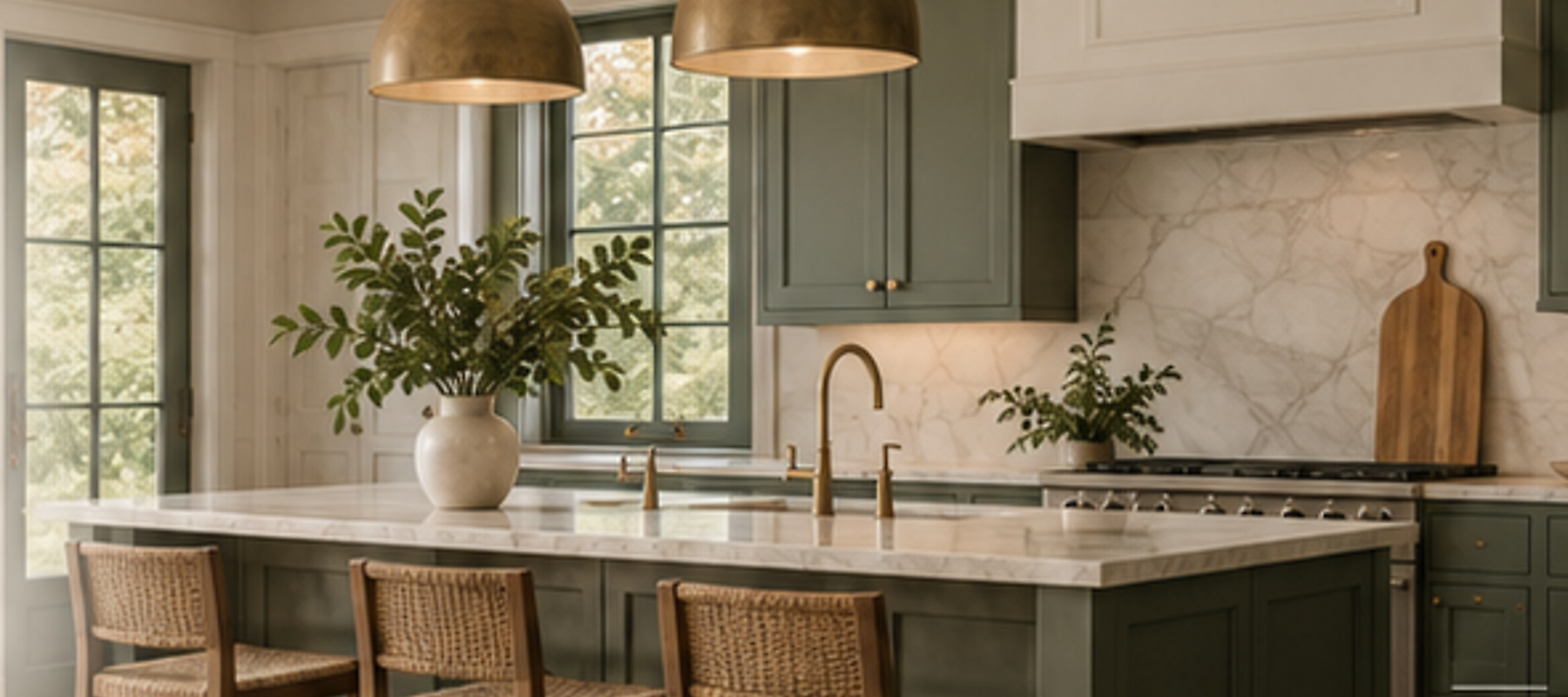
White Oak Renovations is an owner-led residential renovation company in Elk Grove, California. The name carries family history, so the brief was bigger than a contractor logo. It had to feel established and current, and personal without looking homemade.
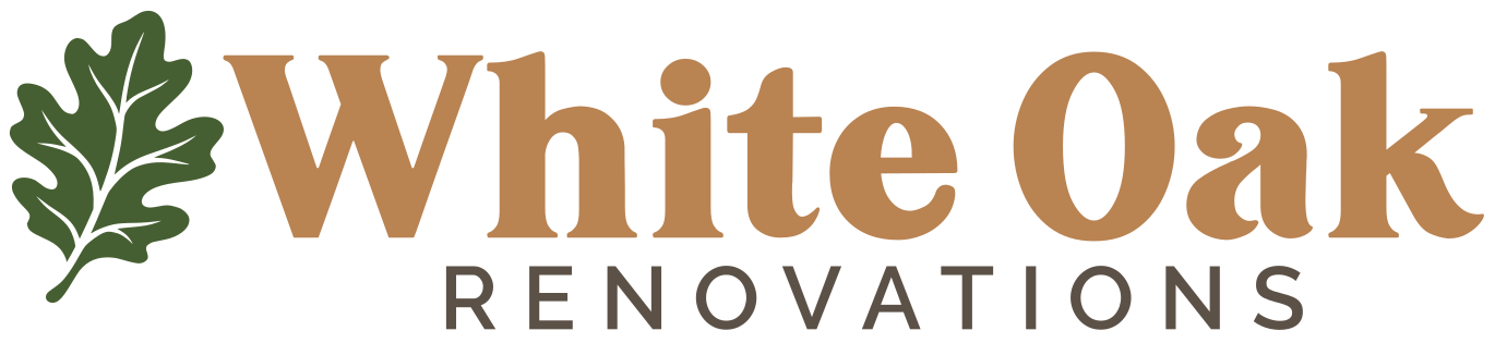
The work was a full brand system and a website meant to feel residential: primary lockup, stacked secondary, leaf symbol, color, type, apparel, vehicle, social avatars, and a responsive site.
Implementation is still pre-launch. This study covers the system that was designed and agreed. It does not invent traffic or conversion numbers.
The challenge
What should White Oak actually feel like as a brand?
A few logo directions were already in play. The founders were split, and competing marks would have shown up on trucks, apparel, invoices, social, and the site.
The risk was launching with more than one identity: a name that looked different depending on which surface you saw first.
One direction both founders could see themselves using on every surface.
Skip the tree, roof, and hammer language most contractor brands use.
Work at 16 px, on a hat, on a truck, and across a full website.
Research + positioning
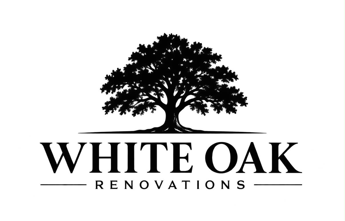
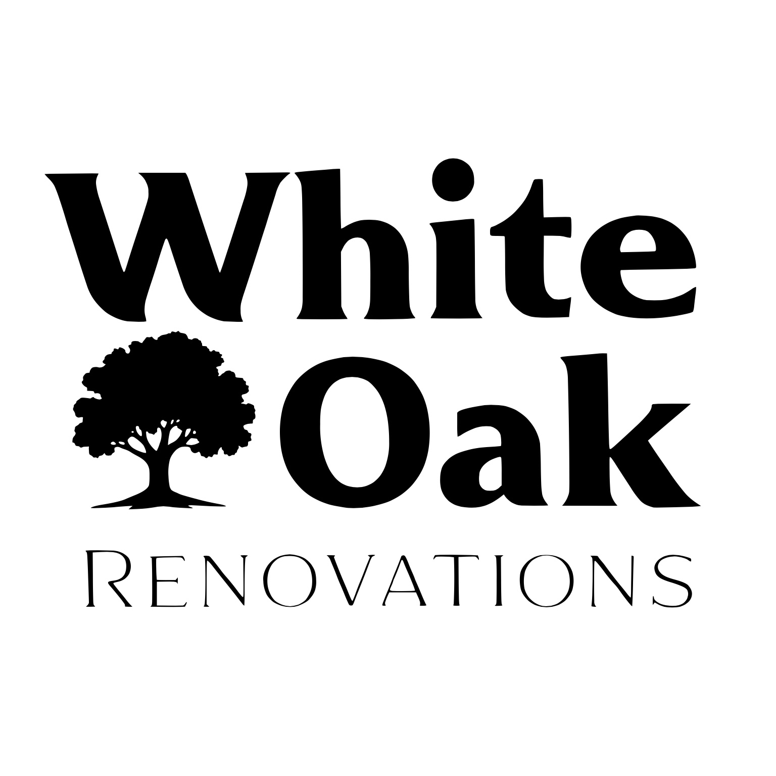
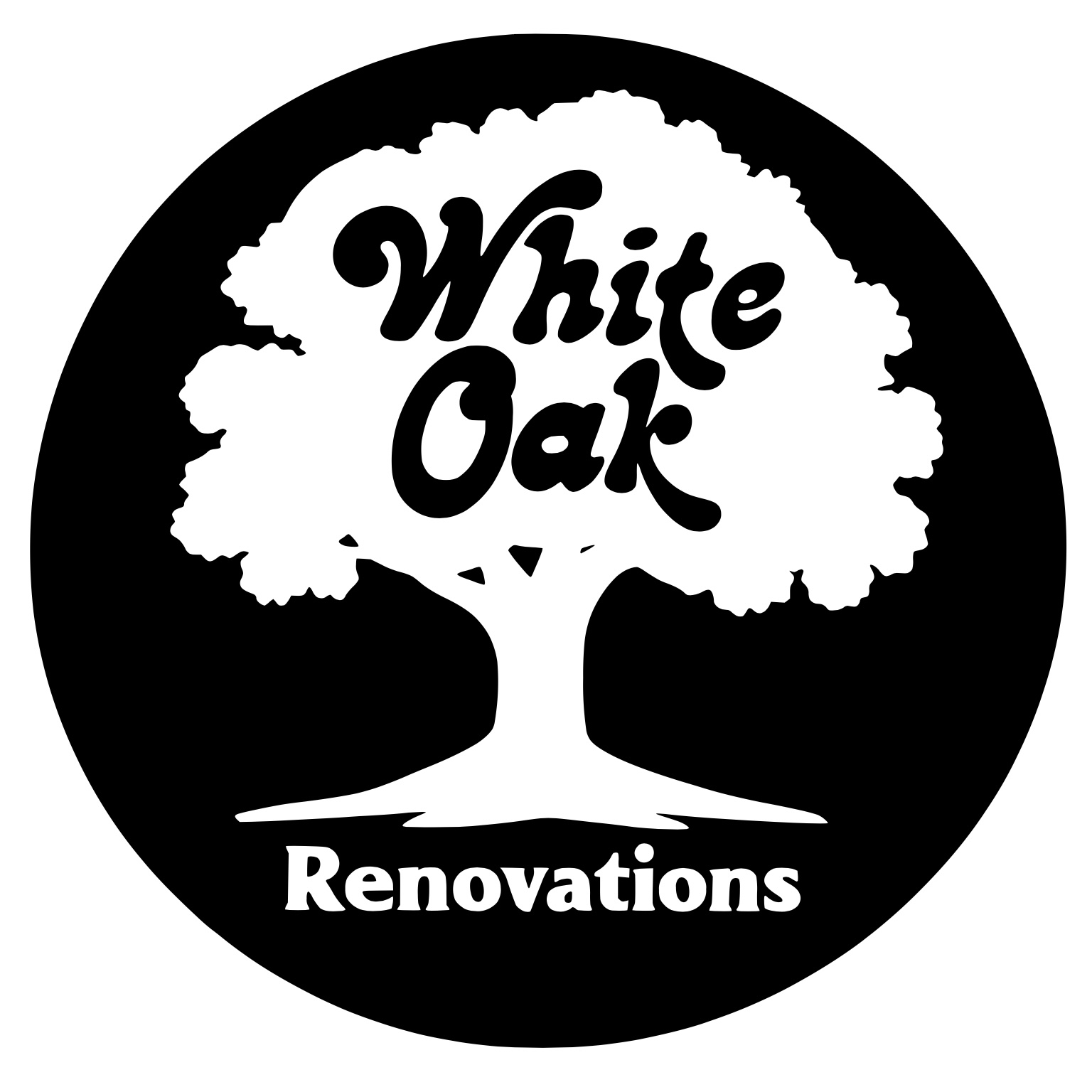
Early directions leaned on a full tree.
A full oak reads instantly as "White Oak," which is why contractor brands with this kind of name default to it. It is recognizable, and already everywhere.
The obvious answer was also the common one.
Research + positioning
From an obvious tree to a leaf that can travel.
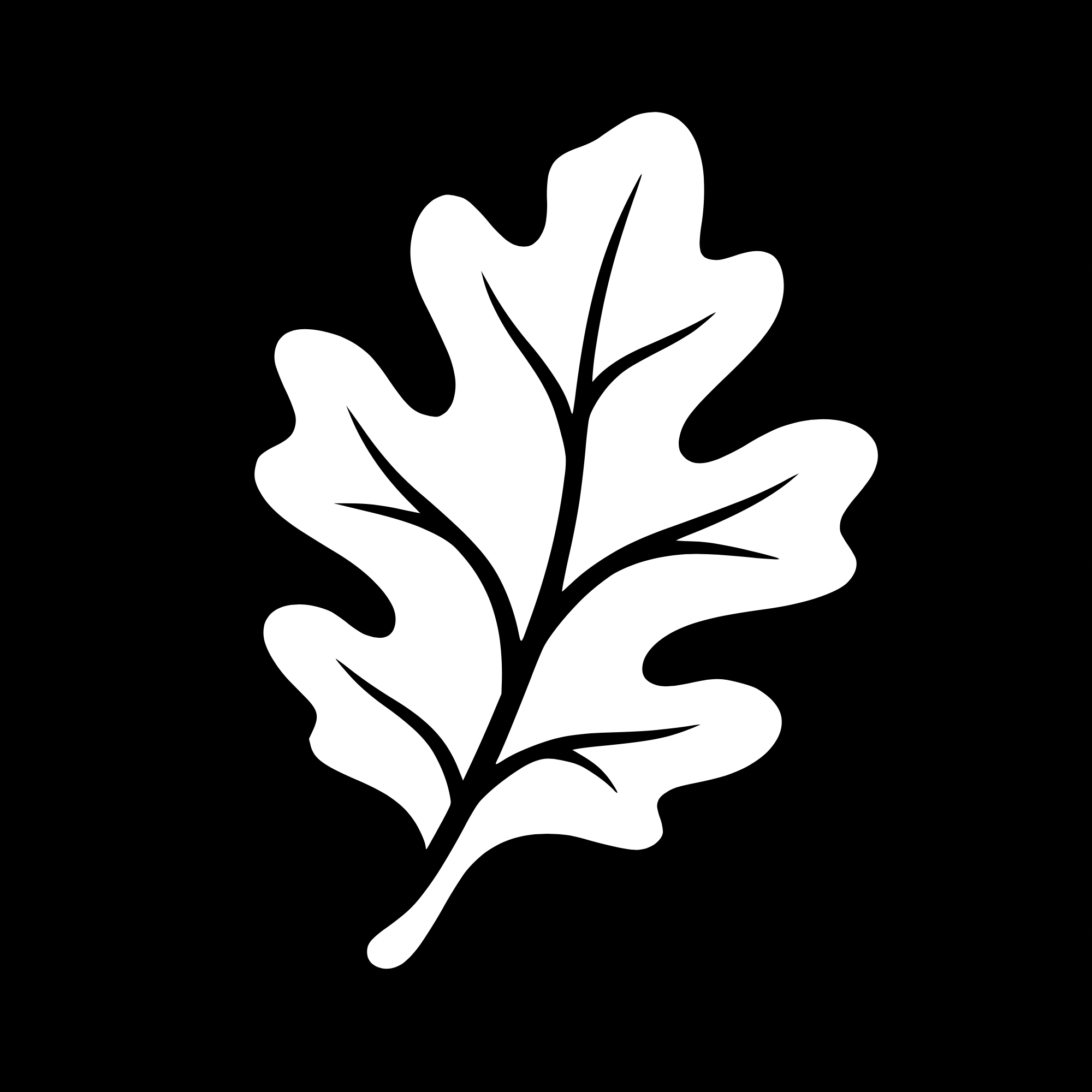
A full oak tree is the obvious mark for this name, which is why contractor brands already use it. The leaf keeps the reference and still works as a symbol at every scale: favicon, avatar, embroidery, watermark.
- Tied to the name. You still read White Oak.
- Works small. Favicon, avatar, embroidery, watermark.
- Harder to confuse. It stays clear of the full-tree contractor badge.
- Holds as a system. The leaf can stand alone and still belong to the identity.
Hierarchy
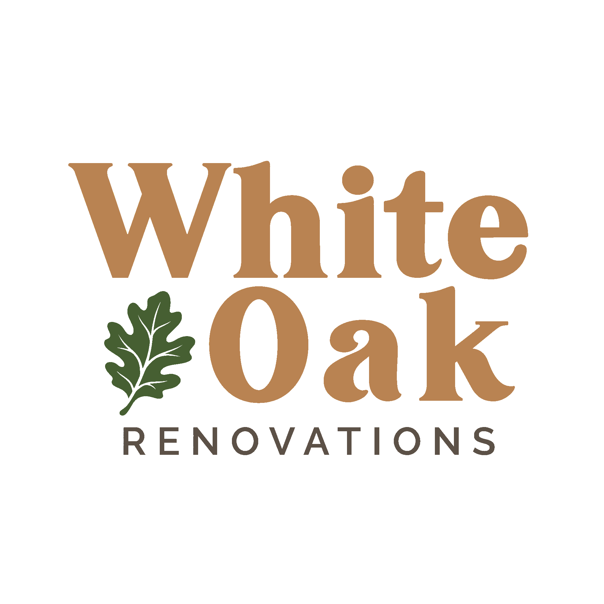
Symbol to White Oak to Renovations. The leaf is the recognisable mark, the wordmark carries personality, and the descriptor stays deliberately quiet.
Rule
The leaf stays upright. Orientation is part of how you recognize it.
Color + typography
Warm materials, quiet contrast.
The palette comes from residential materials, not from typical construction branding. Color does the public-facing work. Monochrome is there for production constraints.
#465F32#B98352#F5F0E8#5C5147Display
Heritage lives in the display.
Karimun for headlines, the wordmark voice, and editorial moments.
Interface
Raleway Medium
Navigation, body, buttons, and secondary information. One voice for the name, another for the work of reading.
Logo system
One identity, multiple jobs.
Application
Readable at a glance.
Let the identity work with the object instead of decorating every available surface.
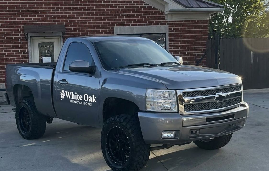
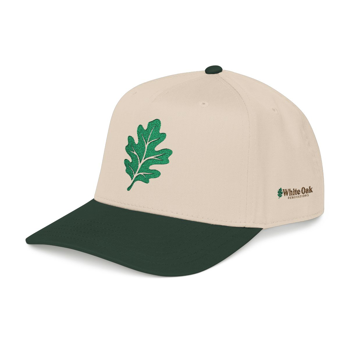
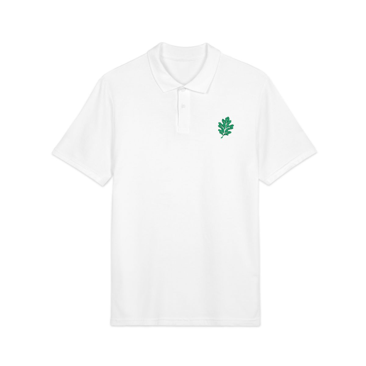
On a dark truck body the reversed mark stays simple. Apparel is where the standalone leaf earns its keep: embroidered cleanly, readable from a distance, without turning the shirt into a billboard.
Digital applications
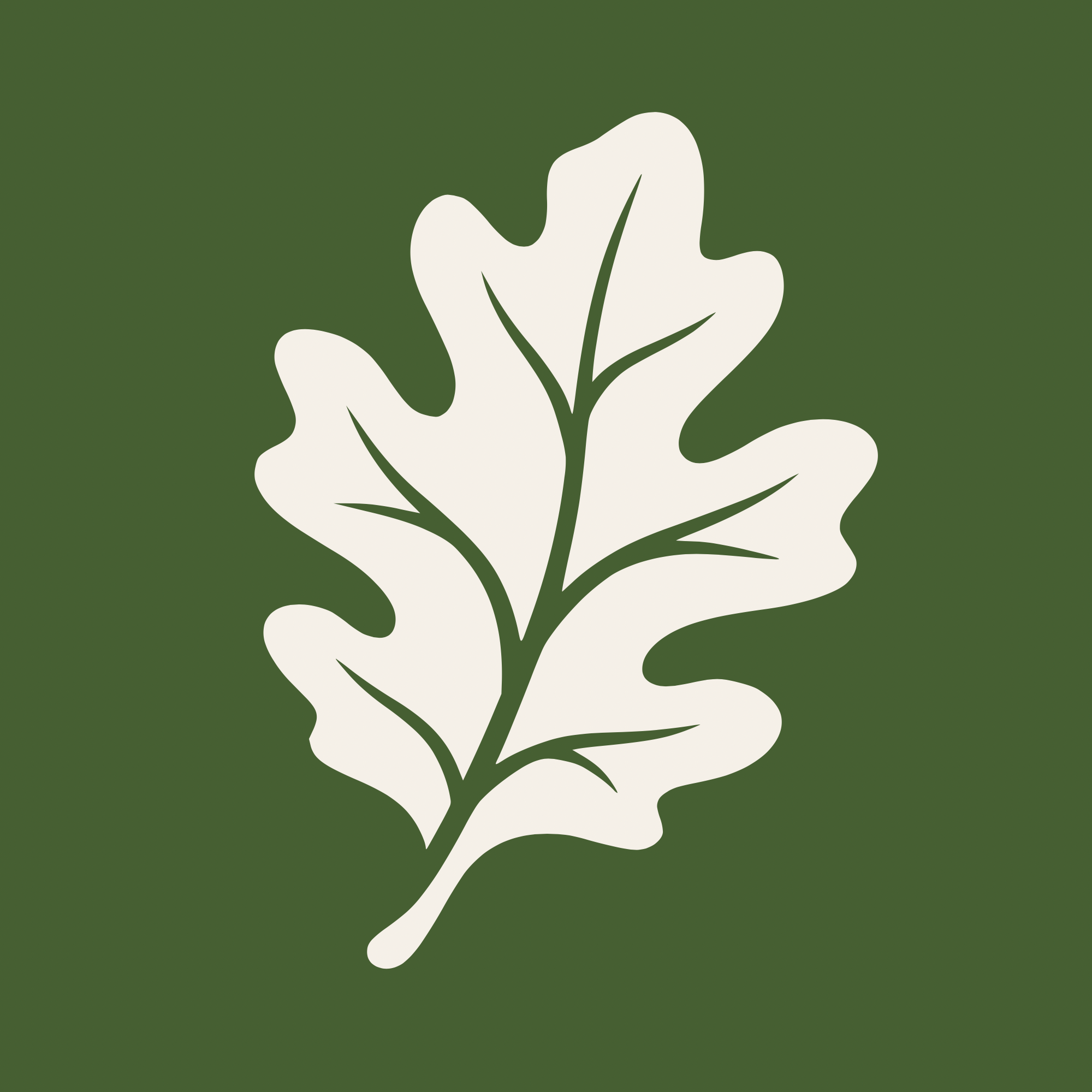
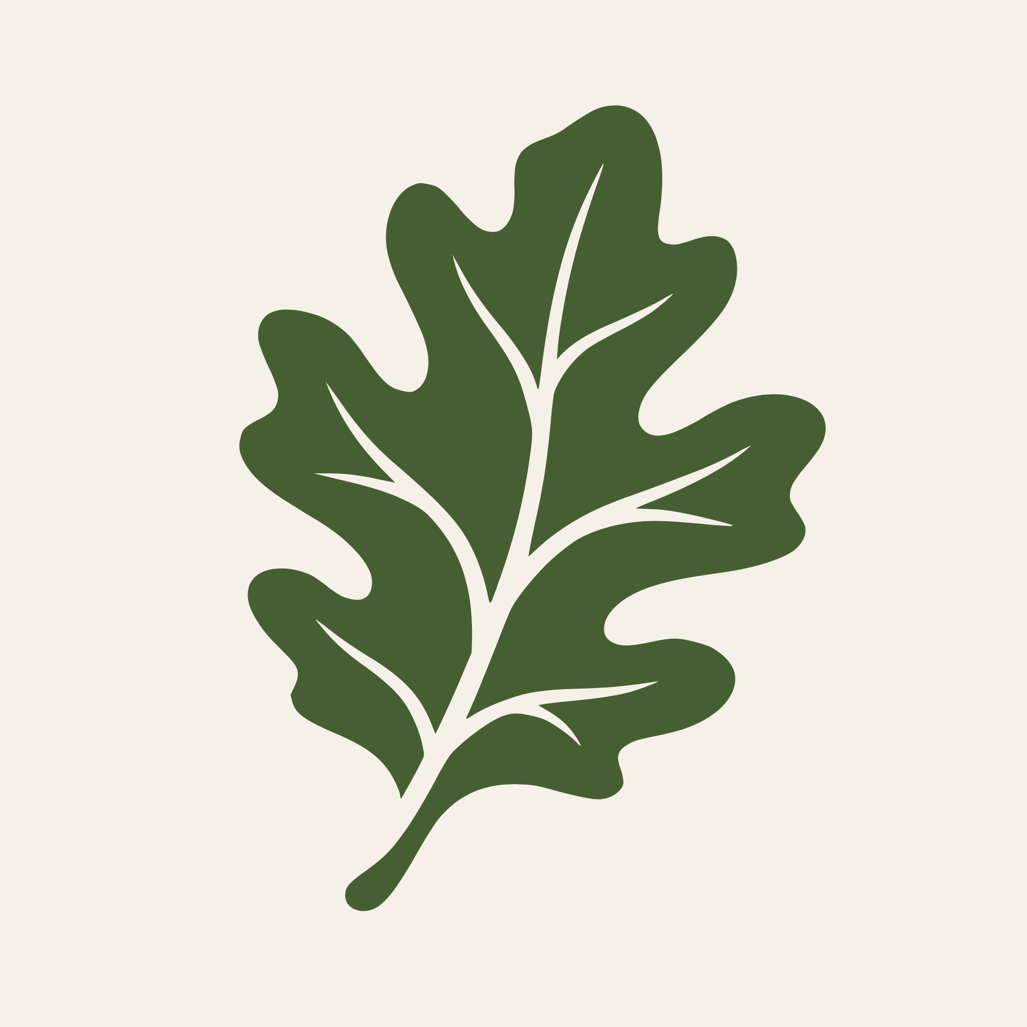
Symbol first when the crop gets small.
A profile picture cannot be a lockup stuffed into a circle. The leaf is the unit that still reads at 110 pixels. Color stays in the system. Orientation stays upright.
Digital experience
The site carries the same tone.
Open full previewThe site is built like a residential editor: large photography, quiet type, and a header that can collapse to the leaf. These are live, scrollable versions of the approved mockup. Use them the way you would use the site.
Photography in the mockup is art direction for the concept. It is not a record of completed White Oak projects. The contact form is mockup-only and does not send data.
Outcome
A system that can grow with the company.
It was the first direction both founders agreed to use. The website is still pre-launch, so there are no traffic or conversion claims here. What holds is the consistency of the system and the process behind it.
The work is a pile of small decisions pointing the same way.
Lockup hierarchy, leaf orientation, color discipline, and a site that speaks in the same voice as the truck door.
Daniel Anderson / Brand + web design