
Case study
GlassFlow Identity
Brand identity for auto glass software that runs an independent shop end to end.
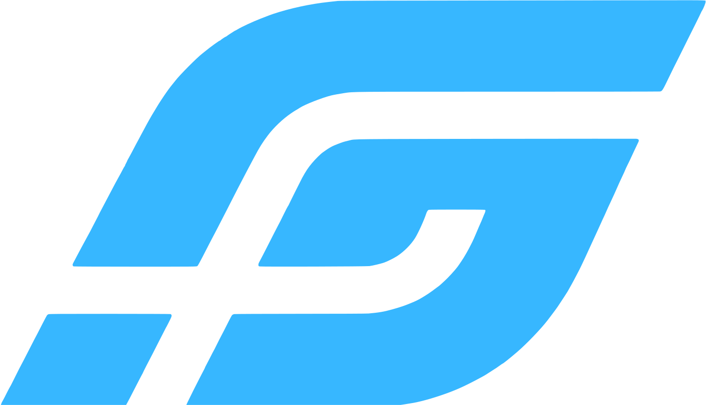
The name is abstract. The mark reads as motion first. Keep looking and a G and an F show up.
Project snapshot
The software had a name. It still needed a mark.
GlassFlow runs an auto glass shop from intake through payroll. The name is glass plus flow. Naming it was the easy part.
The old logo was usable. It just never held together as a brand. I needed a symbol that belonged to GlassFlow, and I did not want a windshield, a pane of glass, or a generic monogram.
It also had to work as an app icon, a favicon, a social avatar, a header, and in one-color print.
Legacy identity
Usable, but not a system.
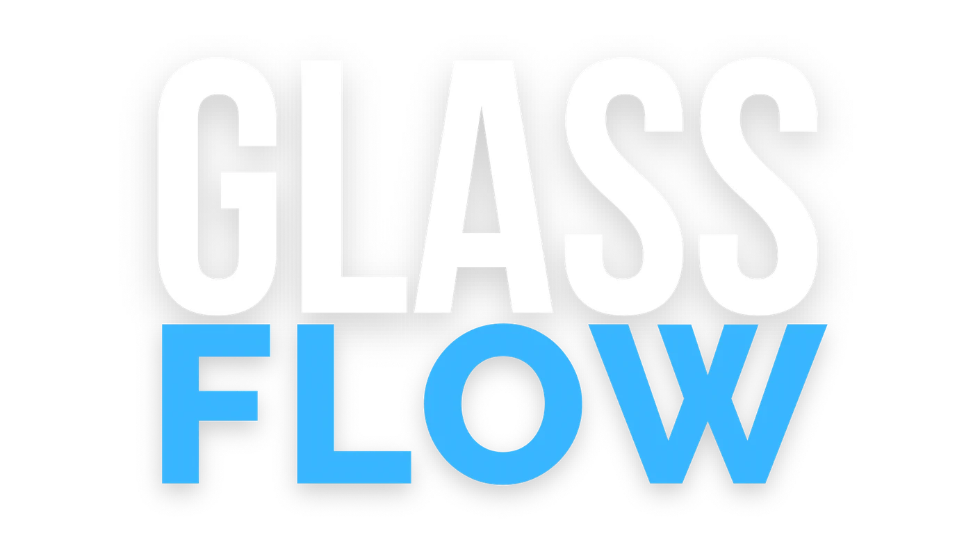
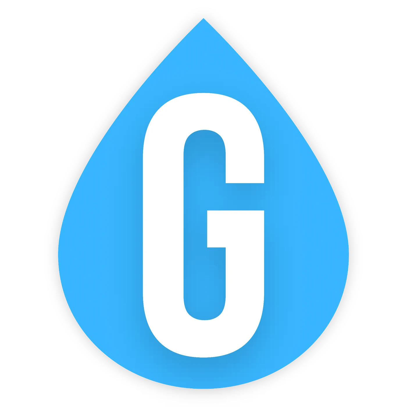
The old GlassFlow mark was a stacked GLASS / FLOW wordmark and a droplet with a G in it. Both pieces worked on their own. They did not come from one system.
Why restart?
"It felt slapped together, uninspired, unintentional."
Process
Concept breadth first. Geometry second.
I used AI for rough concepts. It was fast at generating directions. I did not use it for the final artwork.
When the idea showed up (flow, abstraction, and a G and F that were not obvious), I redrew the mark as an SVG in Canva and set the geometry myself.
- 01AI-assisted concept exploration
Rough directions
- 02Flow first; G / F second
Select the idea
- 03Manual SVG construction in Canva
Draw the mark
The mark
A G.
An F.
Neither.
I stopped trying to make the initials obvious.
You read it as motion first. The outer stroke can be a G. The inside can be an F. You do not need either letter for the mark to hold.
G
F
Production
The final artwork is a vector master.
I constructed the SVG myself. The same geometry feeds the lockups, the app icon, and the 16-pixel favicon.
Alignment
The outer stroke and inner cut stay aligned in the master. Dedicated exports preserve that relationship across applications.
Vector master
The production master is an SVG family: symbol, wordmark, horizontal lockup, and stacked lockup, each in full color, white, and black.
Export system
Dedicated files for app icon (1024), Apple touch (180), favicon (32 and 16), and social avatars. Same geometry and colors, different crop and job.

Hierarchy
The symbol is what you recognize. Glass stays white. Flow carries Flow Blue. Raleway keeps the name plain so it does not fight the mark.
Rule
Leave at least one symbol-height of clear space. No gradients, shadows, distortion, or effects.
Color + typography
Four colors. No supporting shades.
The palette is four colors: Flow Blue, Tempered Blue, White, and Black. Full-color work uses those and nothing else.
#37B7FFSymbol + Flow#4476A5Approved background#FFFFFFGlass + reverse mark#000000Single-color markWordmark typeface
Raleway
The wordmark is Raleway. The type stays plain so the symbol can do the talking.
Logo system
One identity, multiple jobs.
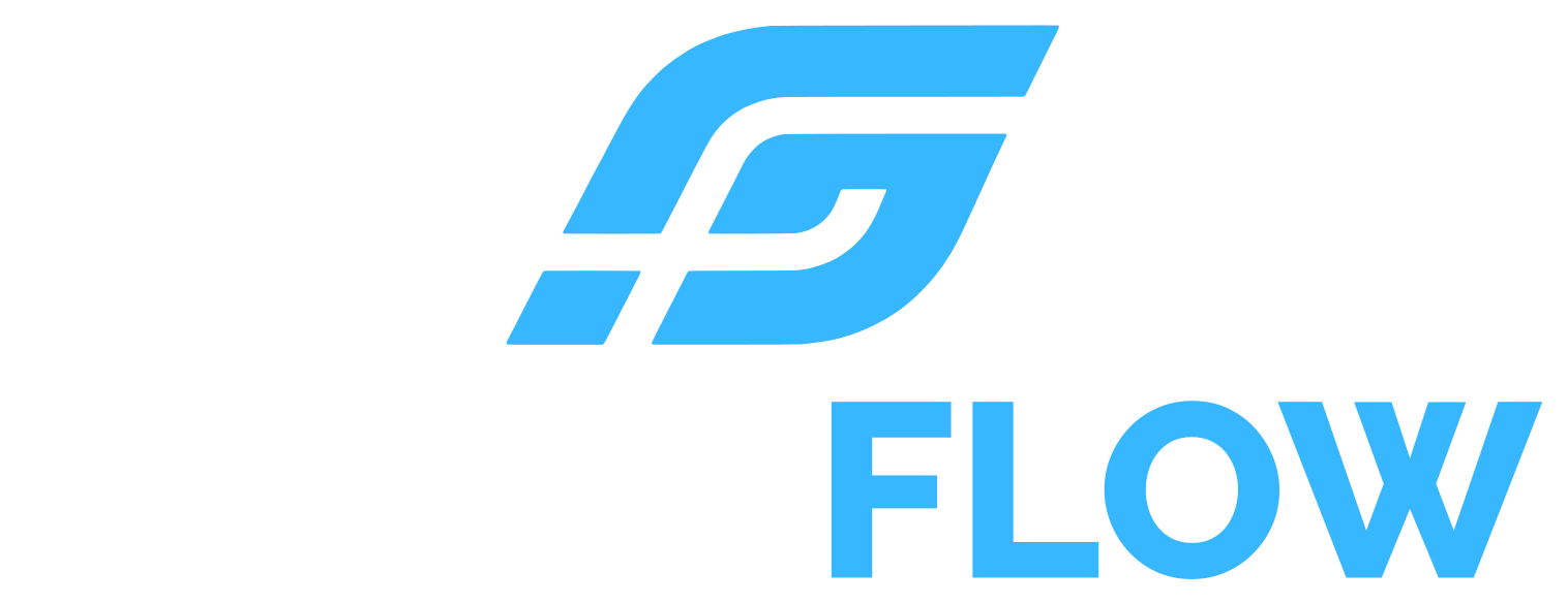

Digital applications
From app icon to 16-pixel favicon.
The symbol carries recognition where the full name cannot fit. The 16- and 32-pixel examples below are displayed at their actual CSS size.


Same geometry and colors, different job. The library has dedicated app, Apple touch, PWA, and favicon files.
Current applications
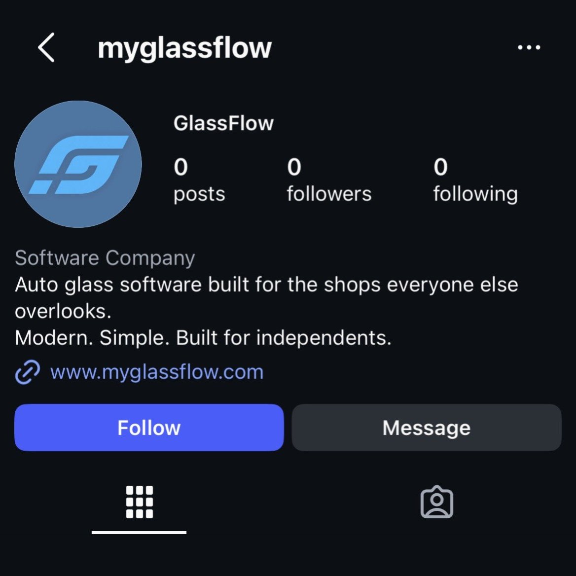
The identity is already public.
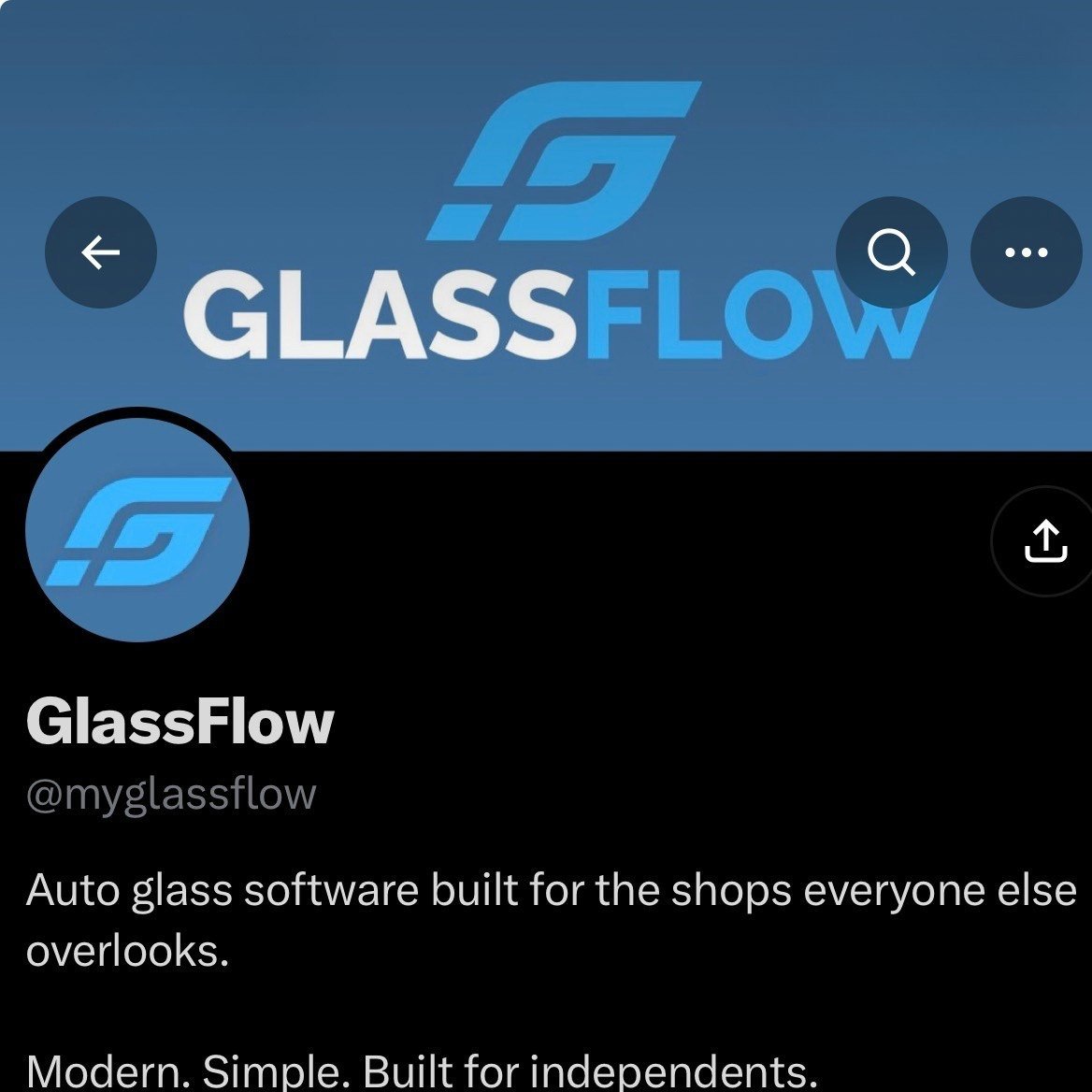
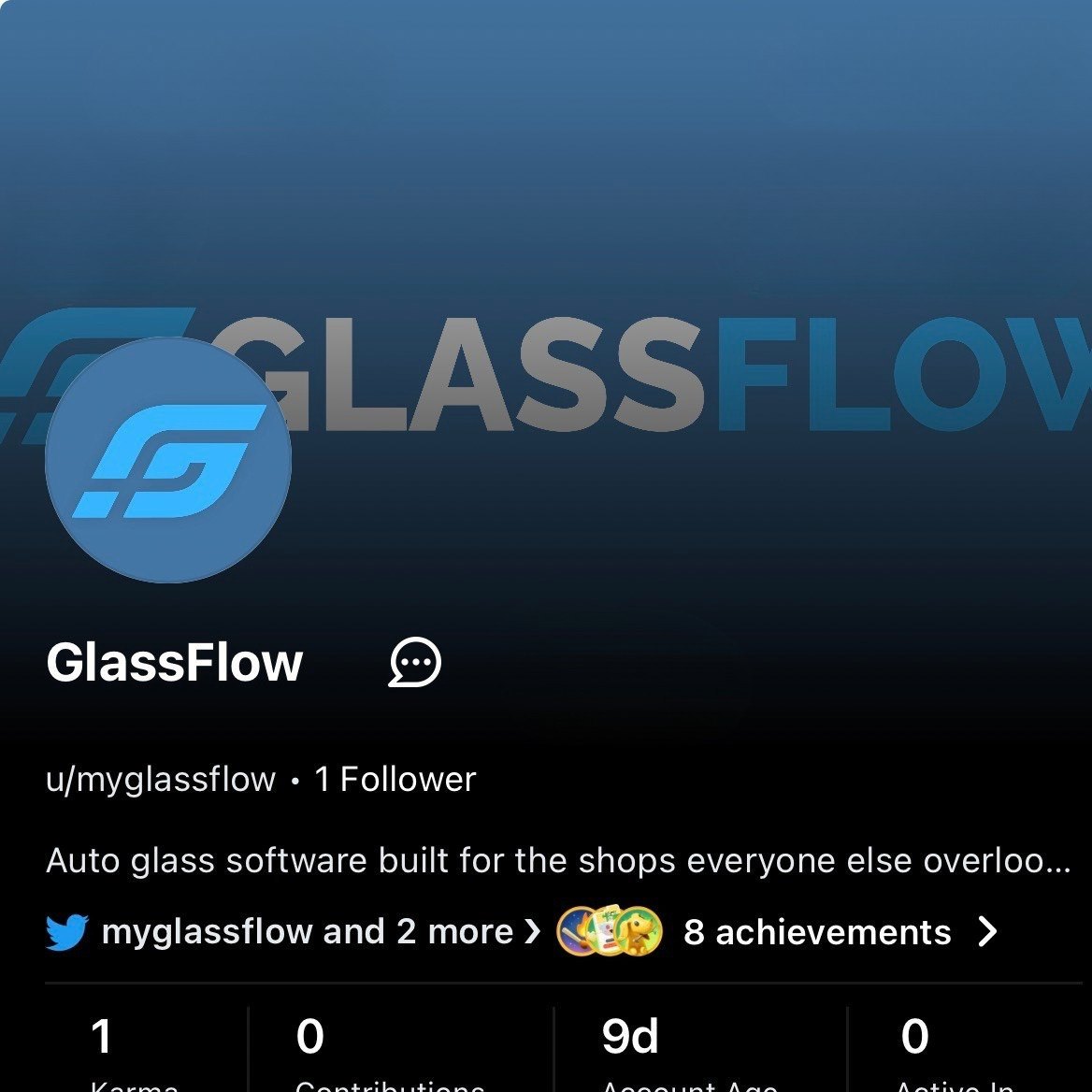
The website and product UI have not caught up yet. The new mark is already on the GlassFlow social profiles. These are live captures, not mockups.
Outcome
A system ready for the product to catch up.
The identity is done. The website and app are still moving over to it. This study is the brand system as it stands, not a finished product redesign.
Daniel Anderson / Brand identity designer